There are numerous concepts, backgrounds, techniques that take the photography world by storm. Some are long lasting, some come and go very quickly, while some stay on to become a mindless cliché. A lot of us know they are cliché yet we still do them. We have our reasons, for some just look cool, some evoke a common emotional response, while others are trying to look artsy. I will be the first to admit I’m a huge hypocrite, or borrow inspiration, but I will declare that openly. What I won’t do is try to pass something off as being artistic when it’s not. To me photos can serve different purposes. They capture memories, capture something amazing looking, are used commercially, are used to evoke emotion, tell a story, or just looking interesting. I don’t think there is anything wrong for taking a photo of something that looks cool, or using a common technique, as long as you’re clear as to what you are representing.
Cool or Cliché Photography – There is a fine line that separates those.
Sometimes what’s cool becomes cliché very quickly, sometimes what’s cliché looks
very cool and should be recreated. Below I summarize types of images that are
redone a lot. Some veer towards the cliché side while some if executed well are
pretty cool. Some I have a strong opinion on while others I have more ambiguous/hypocritical feelings towards. Some views are expressed pretty sarcastically so watch for those ;)
Cool Vs. Cliché
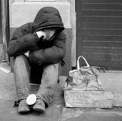
The black and white photo of a homeless man (can include poor children, or people in ratty clothing in third world countries)
Please stop with these. Too many of these photos are exploitative of those individuals for the sake of you trying to look artistic. It had artistic value about 20 years ago when it was first done, now they just look cliché. When visiting new places there are so many interesting things to photograph that you should not rely on what others have done in the past. While getting a snapshot of daily life in another place can be interesting, I would instead like to see images of what the photographer had a connection to. If you do a portrait of a person you had an interesting interaction with and that photo can tell a story I think that speaks volumes over trying to illicit a sad emotional response from guilt.
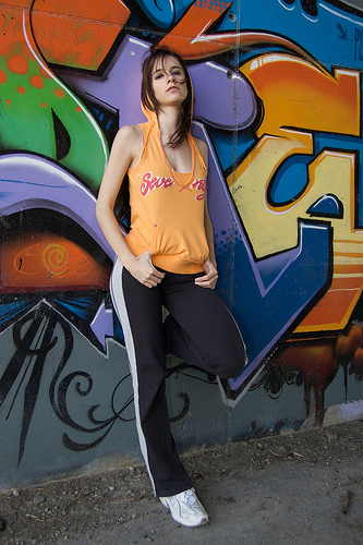
Models against graffiti background
Why do we love models against weird backgrounds? Especially when the background feels out of place. Have a girl in a beautiful dress in some grungy back alley with spray paint and old tires. To me backgrounds should enhance a photo by either providing context, serve as a beautiful backdrop to make the overall image look better, or be very simple and non-distracting to focus on the subject. Would you rather have a couple in front of a brick background or stunning waterfall? That question is often answered by personal taste. Some prefer simplicity, while others like the striking beauty of nature to give oomph to a photo. Others like the contrast of location to the subject, while some like the visual interest in “different” looking backgrounds. My issue is when someone chooses an odd looking background again for the sake of looking artsy.
HDR – High Dynamic Range
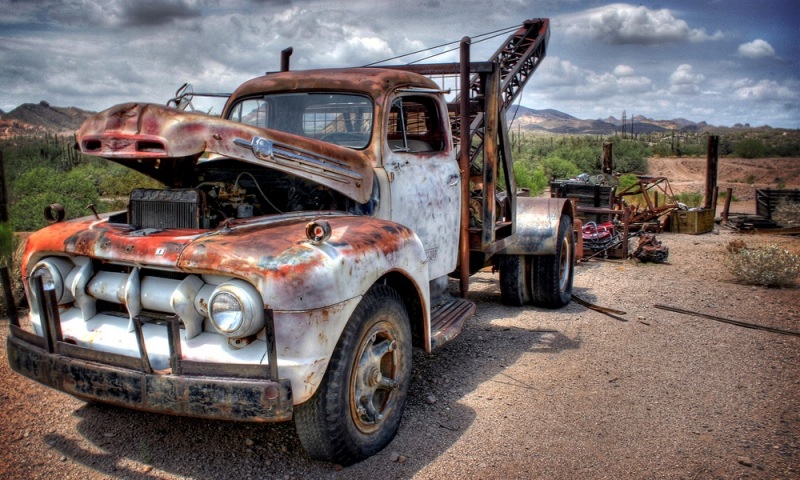
You may not know the term for it, but you have surely seen these images before. You know the really surreal looking photos where you can’t tell if they are a painting or digital artwork. This is one of those cases where a cool technique is adopted by a few, someone makes software for it and boom everyone is popping out surreal looking landscape images or 50’s Chevrolets. A modest use of this technique I think is perfectly acceptable, but when you go full out HDRey and your image looks like it belongs airbrushed on an 80s van then I think it’s too much.
Girl looking out window
What is she looking at? Why is she in her underwear? For some reason photos look very intense when someone looks away from the camera out of a window. That pensive look of the model, the contrasty natural lighting comingin through the window, and usually black and white makes for some deep stuff.
Select Saturation
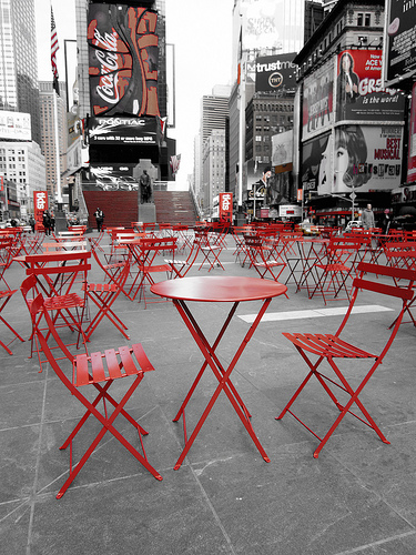
This refers to black and white photos that have a select part of the image in colour. It could be a flower, or the grooms boutonniere, or other part of the image you want to stand out. This can look good 3% of the time. Some people can pull it off, again if done in moderation. For most people it ends up looking silly and amateur.
Wearing Cultural Clothing
You know what makes for a very deep and interesting photo? Get a Caucasian model to wear cultural garb from a far away and exotic land. It can certainly be interesting to highlight different cultures and traditions. Often that’s what makes photography so enticing to viewers is seeing something they are not used to. To me it gets ridiculous when you try too hard to create something exotic. Those photos feel forced and often have ignorance and stereotypes peppered throughout the image.
Marilyn Monroe Pastiche
Please no more Marilyn Monroe remakes, imitations, etc… We all know Marilyn Monroe was an amazing cultural figure. She has some of the most iconic images in the history of photography. Why do people insist on recreating these? They have been remade to death.
Old, rusting, rotting things
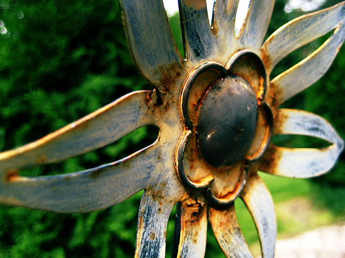
Old cars, pieces of metal, fence, logs decomposing. We like taking pictures of old crappy things. No one takes a picture of a brand new wooden fence in suburbia. But wait 50 years until that wood rots, maybe has some aforementioned spray paint and you’ve got photo magic.
There you have a small list of things that can be cool or cliche. I would love to hear your comments. Is there something I missed? Am I completely wrong in your opinion and you want to destroy my argument?
