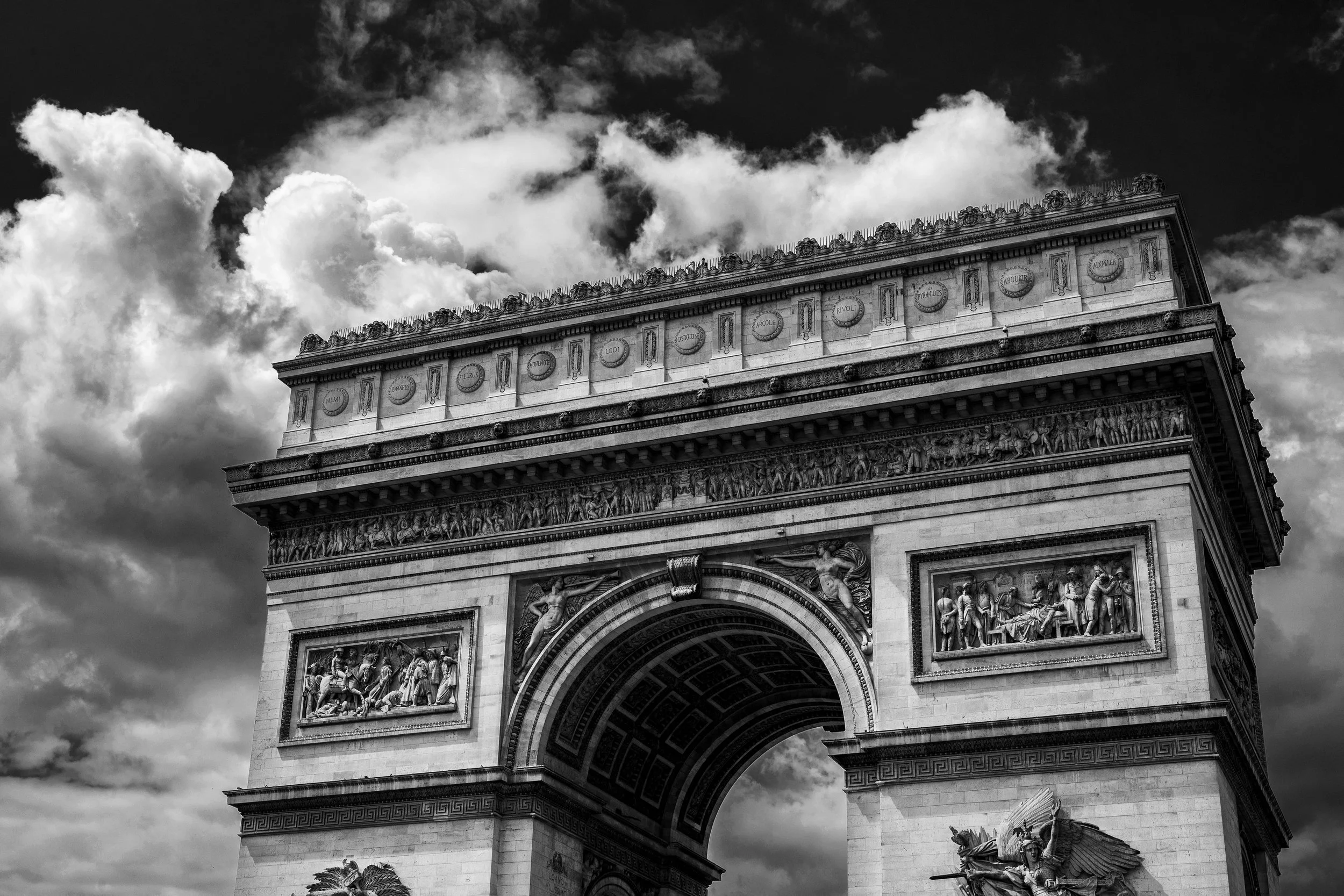
Travel photography from Paris France and the Palace of Versailles.
Read More
Travel photography from Paris France and the Palace of Versailles.
Read MoreTravel photography from Paris France in Black and White
Read MoreTravel Photos from Canterbury, Oxford, Dover, Windsor and Stonehenge
Read MoreTravel Photos from London, England
Read MoreBlack and White travel photography from London England with stops in Oxford, Stonehenge and Windsor.
Read MoreCapturing the designer looks backstage at Hamilton Fashion Week
Read MoreCapturing select designs backstage at Hamilton Fashion Week 2023.
Read MoreNight glow, featuring a variety of images from a special event hosted by Neon Demon Studios and Evil Empire Studios. Stunning displays of moody neon lights made for some great setups.
Read MoreSelections of backstage photos from Hamilton Fashion Week 2019.
Read MoreFitness Photoshoot with Elizabeth in Hamilton.
Read MorePhoto walk through the streets of Chicago.
Read MoreThe beautiful "Marilyn Monroe Towers" shot on a few different occasions.
Read MoreSnapshots of Miami architecture past and present.
Read MoreBefore embarking on a life changing trip to Asia, Ola sat for a portrait session in some great spots in and around Burlington. We decided to capture her in some of her favourite spots at home before uprooting her life abroad.
After choosing the locations we decided to shoot at sunrise. Aside from some logistical advantages to shooting at ungodly hours in the morning, part of my suggestion of a sunrise shoot was also to inject some meaning into the photos. With doing a sunrise shoot I liked the idea of looking east, toward her destination. Sunrise also symbolizes a new beginning for many. As this was the beginning of a new journey for Ola I wanted to build that feeling of a new start into the photos.
After taking in a beautiful sunset we jetted off to some of her favourite spots including a local coffee shop and downtown shops that had a gorgeous old world charm.

It's not often enough that I do behind the scenes posts or discuss the process for photo shoots. I regularly do promotional photography for a local theatre group - Theatre Ancaster. For each show they produce I like to take a different approach to the photography to give each show a unique feel for the promotional photos. I sometimes also take it as an opportunity to try something a bit different outside my usual realm of shooting. Since promoting a musical production is a bit different than typical commercial photography I get to have a bit more fun with the photos and sometimes do things that are a bit more creative than taking a picture of a product in a living room.
For this particular show – The Birth of Rock and Roll, my vision was to re-create old LP covers from the era. There was so much great photography from that era, particularly for music artists. My goal was to match those old photos stylistically.
The first step involved a bit of research. I started with the list of musical numbers performed and tried to find the album art and artist promo photos associated with those albums. In some cases there were album covers or promo shots that were more recognizable than the ones that went with the songs but I tried to stick closer to the era the actual songs were released.
Next was a close examination of the photos. To match them stylistically the first thing I looked at was the lighting of the original photographs. The three main things I looked at for the lighting were the “hardness” of the light, how many lights were used, and the positioning of them. There were a couple of things to look for to figure that out.

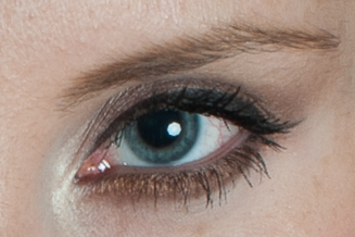
The catch light is the bright white spot in the pupil
First I examined how hard the shadows were. Were they gradual and soft or have a hard edge? I also looked at the catch lights. A catch light is the little sparkle you will see in the eye in photos. Those provide an indication of where the lights were placed and (if the photo is high resolution enough) you can even see the shape and size of the light modifier. For the normal person; a light modifier is just the big attachment you put on the lights to shape the light. Those most common ones people see are umbrellas.
The number of lights used and the positioning of them can also be determined by looking at how shadows fall on a face. If the lighting is pretty even on the face it was likely lit by at least two lights at the front, or one light in the middle overhead. You would look at how even the lighting is plus where shadows fall on the face, while also looking at the catch lights for clues.
After figuring out the lighting I would have to make a plan for how I would edit them in postproduction to match the old timey look. In many cases I knew it would involve increasing the contrast of the photos, smoothing out the skin in an un-realistically soft manner while also adding lots of grain. It would also take a lot of experimenting with colour editing to get the right look. Lots of the photos had a faded de-saturated look, or were just black and white.
Now not all of them matched perfectly. In general I was just trying to get the feeling across hoping some people would draw the connection. In many cases my photos were a bit too sharp and needed to be aged a little more. I also needed to play around more with the processing of the black and white. I got to the point where I was taking some artistic license because I liked the way they looked better. I also did other photos that didn't match an exact album cover but still kept to the feel that I came across when researching artist photos from that era. Overall it was fun to play around with different styles than I normally shoot. It was also a fun challenge to try to dissect a photo and try to re-create it.
Here is a collection of images from the 2015 Hamilton Fashion Week back stage photo shoots.
Read More
I'm hoping this does not come off too ranty but it needs to be addressed. I have had this issue come up about 5 times in the last two weeks and I let it slide but it needs some attention, or education in other terms. This entry originally came from a place of annoyance but I have to recognize people just don't know these things.
As professionals it is our job to educate our clients on what is okay and not okay with the work we give them. At the end of the day we give away an artistic product/work. If you receive photos from a professional photographer... do not edit them yourselves. We cringe when we see a photo we've spent an hour retouching destroyed by a Mayfair instagram filter or some weird grunge texture from your Nik FX software.
You may be given photos at different levels of "completion". Every photographer is different with what they send you in terms of resolution, amount of editing, watermarking, proofs, edited images, etc. I can speak to what I provide and what I expect from you.
I send clients proofs. Meaning these are photos that are narrowed down for them to select their final retouched images. All of my proofs have some degree of editing which could include exposure, colour correction and cropping. These proofs in many cases are close to a final product. Because they are close to a final product I don't mind my clients posting these images online (for now, I may change that policy in the future).
It is at the retouching stage where I make certain choices. Aside from editing out blemishes, stray hairs and all the usual stuff it is at this stage I decide how to further process the image. Sometimes I process the photo in black and white or do specific colour grading that I think is appropriate to the image. These are the "final" images that my clients and myself should be showing off to the world.
When clients are posting images it is really important that they do not alter the image. People may like the aesthetic of how their image looks with a certain Instagram filter, with changed exposure settings or cropped a certain way. It is not appropriate for anyone to change the images they have been given. The photographer has made conscious choices to create the photo in a specific way and the work needs to be left as is. One exemption I make is for head shots where certain profile pictures only have the option for a small square avatar.
Some people may say it's no big deal or they noted it's unedited or filtered. The problem is others may view that work and think that is the level of photograph they receive from the photographer. It is not an accurate representation of that photographer's artistic vision or technical skill.

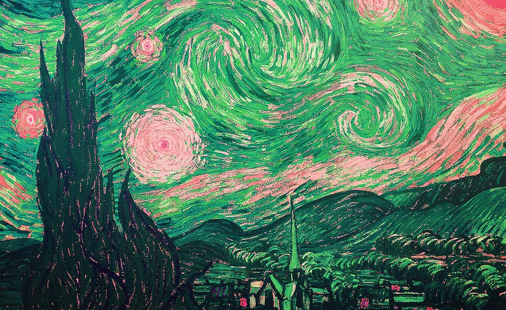
Yes, i'm comparing myself to Van Gogh and DaVinci to prove a point.

One issue that may come up is people assuming that because the photo is of THEM, they can do what they want with the photo which is not true. Since the photographer owns the copyright to the photos they take they maintain control over what can be done with that photograph.
So at the end of the day it's not the end of the world for me. But I ask that you respect those wishes with the work I produce for you.
"Take care of yourself... and each other." -Jerry Springer
A look into some of my time with Woodview Autism and Mental Health Services in creating promotional material to promote their upcoming fundraising event iFLY for Woodview. An inside look into their programs and what impact they have on the community.
Read MoreAugust is to summer what Sunday is to the weekend. There's that sad feeling that it's all over. Some are excited about the transition to fall, whereas others want that endless summer. To me, that late summer feeling makes me see everything through vintage muted goggles.
Model: Kristina Jovanovic
Hair and Makeup by Aleksandra Stanojevic
It seems that classic style is back in a big way. The suits that your dad used to wear and got stuffed in the back of their closets are now on the front cover of GQ. Modern mens fashion has evolved by reintroducing the classics but mixed with youthful grooming, and beards. It's refined with some edge embracing the BAMF attitude.