It's not often enough that I do behind the scenes posts or discuss the process for photo shoots. I regularly do promotional photography for a local theatre group - Theatre Ancaster. For each show they produce I like to take a different approach to the photography to give each show a unique feel for the promotional photos. I sometimes also take it as an opportunity to try something a bit different outside my usual realm of shooting. Since promoting a musical production is a bit different than typical commercial photography I get to have a bit more fun with the photos and sometimes do things that are a bit more creative than taking a picture of a product in a living room.
For this particular show – The Birth of Rock and Roll, my vision was to re-create old LP covers from the era. There was so much great photography from that era, particularly for music artists. My goal was to match those old photos stylistically.
The first step involved a bit of research. I started with the list of musical numbers performed and tried to find the album art and artist promo photos associated with those albums. In some cases there were album covers or promo shots that were more recognizable than the ones that went with the songs but I tried to stick closer to the era the actual songs were released.
Next was a close examination of the photos. To match them stylistically the first thing I looked at was the lighting of the original photographs. The three main things I looked at for the lighting were the “hardness” of the light, how many lights were used, and the positioning of them. There were a couple of things to look for to figure that out.
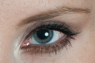
The catch light is the bright white spot in the pupil
First I examined how hard the shadows were. Were they gradual and soft or have a hard edge? I also looked at the catch lights. A catch light is the little sparkle you will see in the eye in photos. Those provide an indication of where the lights were placed and (if the photo is high resolution enough) you can even see the shape and size of the light modifier. For the normal person; a light modifier is just the big attachment you put on the lights to shape the light. Those most common ones people see are umbrellas.
The number of lights used and the positioning of them can also be determined by looking at how shadows fall on a face. If the lighting is pretty even on the face it was likely lit by at least two lights at the front, or one light in the middle overhead. You would look at how even the lighting is plus where shadows fall on the face, while also looking at the catch lights for clues.
After figuring out the lighting I would have to make a plan for how I would edit them in postproduction to match the old timey look. In many cases I knew it would involve increasing the contrast of the photos, smoothing out the skin in an un-realistically soft manner while also adding lots of grain. It would also take a lot of experimenting with colour editing to get the right look. Lots of the photos had a faded de-saturated look, or were just black and white.
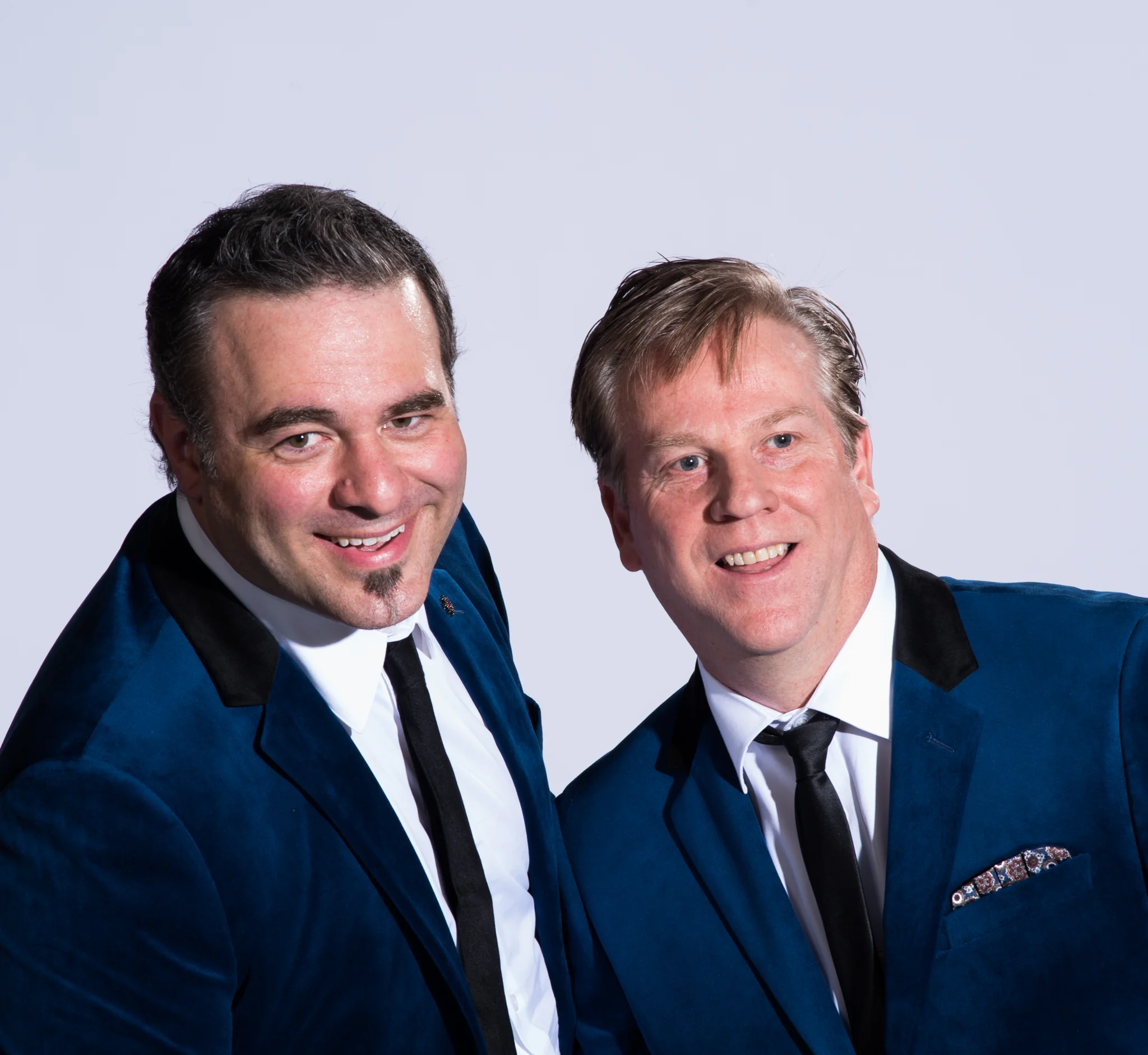
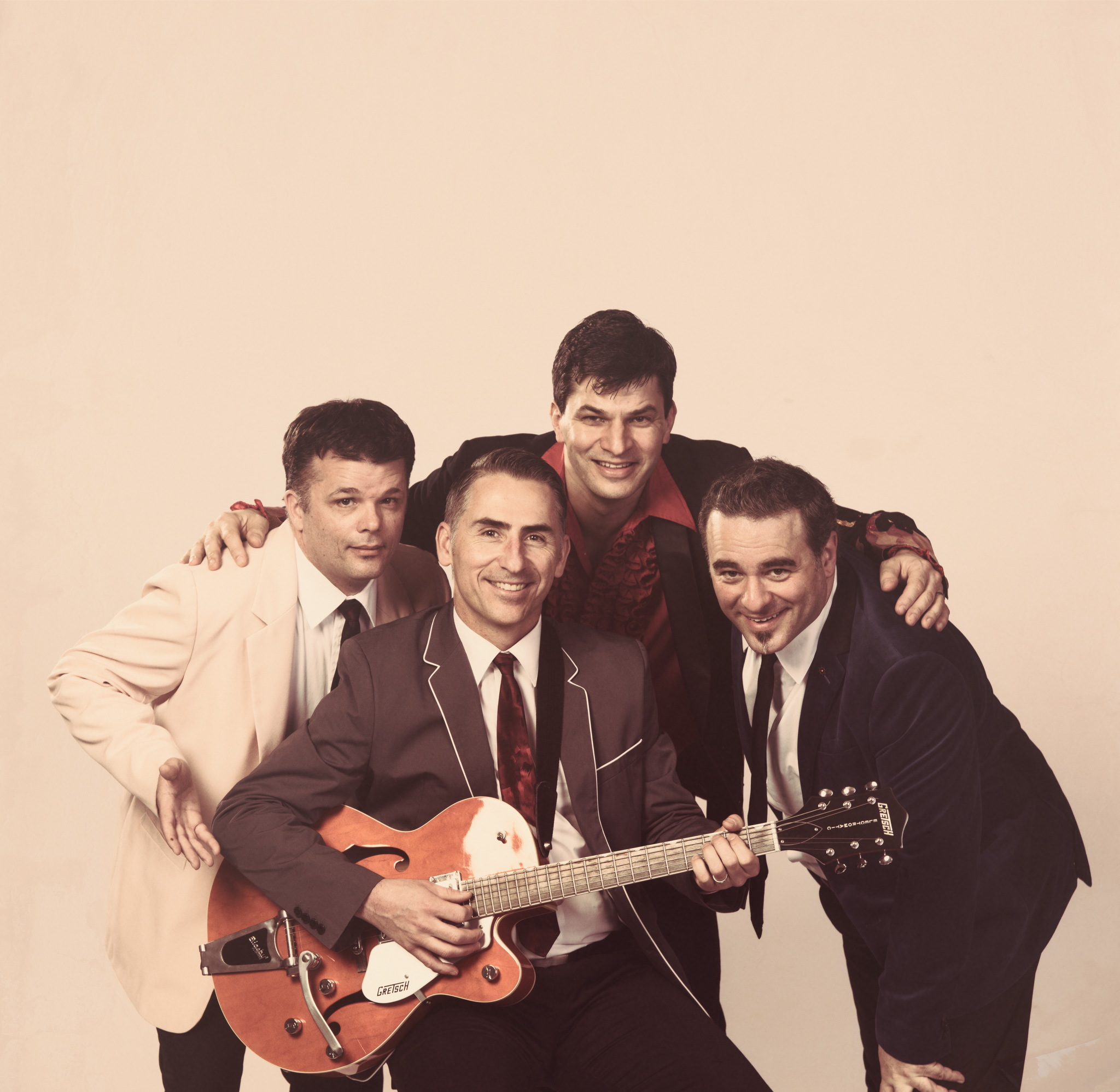
The Promo Shots
Now not all of them matched perfectly. In general I was just trying to get the feeling across hoping some people would draw the connection. In many cases my photos were a bit too sharp and needed to be aged a little more. I also needed to play around more with the processing of the black and white. I got to the point where I was taking some artistic license because I liked the way they looked better. I also did other photos that didn't match an exact album cover but still kept to the feel that I came across when researching artist photos from that era. Overall it was fun to play around with different styles than I normally shoot. It was also a fun challenge to try to dissect a photo and try to re-create it.


